It's up!
My new website is ported and published.
Back in 2017, I decided to create a personal site. Reviewing tools, I landed on Jekyll (https://jekyllrb.com/), a static site generator (SSG) written in Ruby. SSGs are tools for creating websites as static bundles of files through a build step that transforms templates and content. With no database or server-side logic, deployment is simply the copying of output files to a hosting server. Jekyll stood out as well-documented, blog-aware, and free to host on GitHub via GitHub Pages.
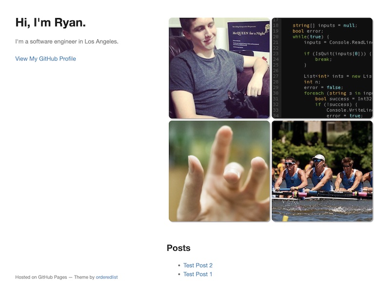
Before long, I had a domain name registration and a starter Jekyll project with photos, code samples, and placeholder posts. Configuring hosting through GitHub Pages was simple—a few DNS records and a configuration file in the repository.
And then? Not much.
Lacking content and polish, the site lay dormant. Despite minor changes—adding a jQuery lightbox plugin (Featherlight) and experimenting with a new layout (Hyde)—it was never finalized and made ready for public deployment.
Fast-forward to a few months ago. With some time having passed, I saw an opportunity to reflect and discover. I was particularly inspired by reading posts and exploring the personal websites of some of the blogosphere's brilliant minds:
- http://www.paulgraham.com/
- https://www.henrikkarlsson.xyz/archive
- https://stewartsmith.io/
- https://nathanrooy.github.io/
- https://maximeheckel.com/
With this inspiration, I returned to the drawing board.
My goals for a refresh were threefold:
- Simplify the project structure and consider changing frameworks.
- Refocus the site toward professional experiences, posts, and demos.
- Revamp the site's look and feel.
I started by reviewing frameworks. I would stay with an SSG, but given the maturity of the JS ecosystem, I saw it likely that a pure JS/TypeScript offering would be available. I found this to be true with 11ty (https://www.11ty.dev/)! 11ty's simplicity, feature set, and JS core made it a great fit, while its broad commercial adoption by the likes of NASA, Google, Netlify, MIT, Foursquare, etc. spoke to its quality and long-term prospects.
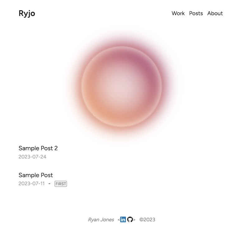
For the site's content, I wanted to streamline presentation and reduce the number of sections. I eschewed a detailed biography and overly specific topic sections ('code', 'photos', 'rowing') as they could fall within generic categories. I decided on 'home', 'work', 'posts', and 'about', keeping the focus on professional and creative output while maintaining a capacity for subtopics of interest.
With the layout decided, I wished to implement a simple and complementary styling. Nathan Rooy's personal site (https://nathanrooy.github.io/) was influential in this. I borrowed the black-and-white color scheme and the list presentation style for posts. I deviated, however, with a non-collapsible header and a conspicuous homepage decoration. This resulted in a playful minimalism—maintaining clarity while incorporating a few punchy elements or demo previews.
The result...
Overall, the implementation was pleasant and straightforward.
Some interesting moments included:
-
Learning 11ty's WebC language as a mechanism for components (similar to Single File Components in Vue, but less dynamic and resolved to HTML at build time).
-
Learning template language support (Nunjucks) for passing data to WebC components:
{% for post in collections.post | reverse %} {% renderTemplate "webc", { post: post } %} <post :post="post" webc:keep></post> {% endrenderTemplate %} {% endfor %} -
Picking a decorative element for the homepage.
All in all, I'm pleased and looking forward to adding more content.